
TU-95 Tupolev Soviet Bomber. Referred to NATO as The Bear. At over 150 feet in length, this four-engine turboprop-powered strategic bomber and missile platform was first flown in 1952. It entered service with the Soviet Union in 1956 and quickly became an icon of the Cold War threat to North America.
In 1997 Greg Marshall had completed a half- hour video documentary called Tracking Distance. Set upon the remnants of Canadian Forces Station (C.F.S.) Dana, a NORAD Pinetree Line radar station, which operated from 1962 – 1986, it examined some of Canada’s role during the Cold War. With over 200 service personnel and their families present at the site it officially closed August 30, 1987. In 25 years of operation, countless military families and personnel were connected with the station. The video explores what remains and what people thought of Cold War situation during its operation. It is based on interviews with a variety of individuals, each with a personal connection to the closed radar station. Last broadcast on SCN TV 2004, after a 5 year broadcast license, it originally debuted at 1998 Yorkton Film Festival. Production was made possible through a co-production with The Banff Centre for the Arts, EM Media, with financial assistance of the Alberta Heritage Trust Fund and the NFB. You can watch it the video online at TrackingDistance.com
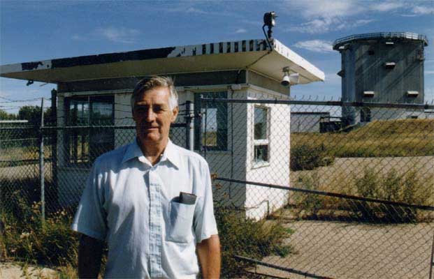
Retired radar technician John Armstrong stands before an old guardhouse at a NORAD radar site, 1997, CFS Dana, Saskatchewan.